Executive summary
1000s
Fabric and trim combinations navigable through one guided flow
Previously: static PDFs and manual back-and-forth
Live
Picario render updates on every material selection
No page reload. No guesswork about the final look.
↓ errors
Fewer ordering mistakes in the production handoff
Order summary maps directly to production fields
Styleflow is a garment configurator built into Trinity's dealer portal. Dealers select a base garment, filter a fabric catalog, pick trims, and watch a Picario-rendered preview update in real time. The final configuration generates a production-ready order summary. I designed and built every part of it — from the UX flow to the React components.
The problem it replaced wasn't a bad interface. It was no interface at all. Dealers were making thousands-of-dollars purchasing decisions by emailing static fabric swatches back and forth and hoping the final garment matched the mental image.
My role
What I owned
End-to-end design and front-end implementation. UX flows, Figma prototypes, every React component in the Styleflow feature — Browse, Visualize, Fabrics, Materials, Buttons, Threads, Zippers, Ribknits, Rack, Stylepage. Also built the admin analytics view for tracking usage.
What I collaborated on
The Picario rendering pipeline, the relevantMaterials API design that drives dynamic trim steps, and the Dry::Validation contracts on the visualizer API endpoints. The backend data model already existed — my job was designing how the interface responded to it.
The challenge
The previous buying experience wasn't broken — it was absent. Dealers browsed a physical sample book or a static PDF catalog, emailed a fabric code to a sales rep, and waited. There was no visual preview, no trim selection interface, and no production-ready output. The gap between "what I think I ordered" and "what arrives" was entirely invisible until the garment was being made.
The ordering error rate wasn't just a user experience problem. Errors in a custom apparel workflow are expensive — a wrong lining or button selection on a bespoke suit doesn't have a simple return flow. The cost of ambiguity lands on operations.
User constraints
- Thousands of fabric and trim combinations to navigate
- Visual outcome unclear before ordering
- Non-technical dealers needed guided decisions
- Complex garment rules vary by style type
Technical constraints
- Picario rendering is external — the UI must handle loading and fallback states
- Trim options are not static —
relevantMaterialsis API-driven per garment type - Output must map to production fields — not just look right
- MUI component library for all UI primitives
Discovery
Before designing anything, I mapped the full API surface: every endpoint the visualizer would need to call, every response shape, and every constraint the backend imposed. Two things became clear immediately.
First, the trim steps aren't fixed. A topcoat doesn't have a button step because Picario can't render one on that silhouette — the backend knows this and excludes it from relevantMaterials. The interface had to be dynamic, not templated. Every hardcoded trim step would eventually be wrong for some garment type.
Second, the garment configurator is actually two products sharing one codebase. Browse mode (finding fabrics) and Visualize mode (configuring a garment) have fundamentally different jobs. Conflating them would have produced an interface that does neither well.
Key insight
The configurator isn't complex because the product is complex. It's guided because the product is complex. The interface's job is to absorb the complexity so the dealer never has to see it.
Product strategy
The strategic frame was progressive complexity. Show only the current decision — not all decisions. Let the dealer move step by step: garment type, collection, fabric, then trims in the order the API defines. At any point they can jump back without losing their selections. Power users can navigate freely. New users are never overwhelmed.
The two-panel layout — rendered garment image on the left, configuration controls on the right — came from the same principle. The preview is always visible. It's not a confirmation screen at the end; it's a constant feedback loop that updates with every selection. Dealers see the garment becoming real as they configure it.
"I can finally show customers exactly what they are ordering before we submit."
Sales team, post-launch feedback
That quote captures the product goal exactly. Styleflow isn't a tool for Niki or for operations — it's a tool dealers use in front of clients. The interface needed to be presentable, not just functional. A cluttered or confusing configurator reflects on the dealer's professionalism. That shaped every visual decision.
Information architecture
The configurator follows a linear path with two entry points and a branching trim section that the API controls.
Step 3 — Fabric — is where the Picario preview first renders. From that point on, every trim selection updates it live.
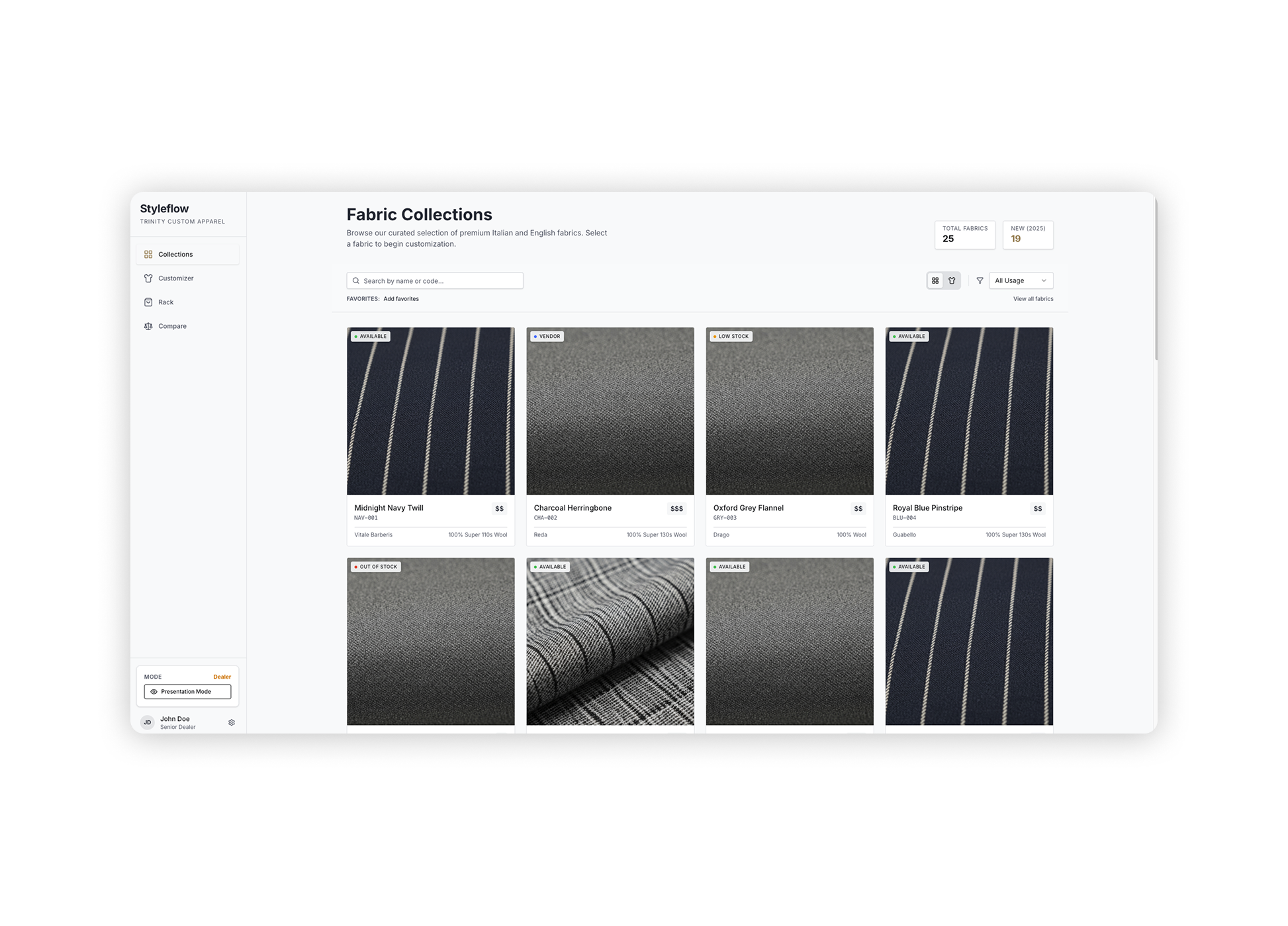
The step-by-step configuration flow. Each step maps to one decision. The dealer never sees all decisions at once.
Racks — individual configured garments — group into Stylepages. A dealer building a three-piece suit creates three Racks (jacket, trouser, vest) and saves them together as a Stylepage tied to a client. Stylepages become the persistent artifact — shareable, revisitable, and convertible to an order.
UX decisions
Four decisions defined the product. Each one had an argument against it — that's what made them worth making explicitly.
01
Filter-first fabric exploration — filters before the catalog, not after.
The obvious alternative: show all fabrics and let dealers search. Simple to build, familiar pattern.
The catalog is too large for search to feel manageable. Presenting thousands of options and asking dealers to filter down produces a different cognitive experience than presenting a small, filtered set and letting them expand. High-signal filters — material family, weight, use case — reduce the visible option set to something that feels curated rather than overwhelming. Dealers feel like they're finding the right fabric, not eliminating wrong ones.
02
Live Picario preview with full state persistence.
The alternative: show a preview at the end, after all selections are made.
End-of-flow confirmation is a test. Live preview is exploration. When the garment renders immediately and updates with every trim selection, dealers explore combinations they wouldn't have thought to try. The preview changes the nature of the interaction from "filling out a form" to "building something." State persistence — selections survive navigation between steps — removes the anxiety of exploration. Trying a different lining doesn't mean starting over.
03
Dynamic trim steps driven by the API — nothing hardcoded.
The easy path: build a fixed sequence of trim steps (lining → button → thread) and show all of them every time.
This breaks for topcoats (no button), casual shirts (different lining logic), and any future garment type the backend adds. The relevantMaterials array in the API response defines exactly which trim steps apply to the selected garment type. The interface reads that array and renders the right steps in order. Adding a new garment type to the backend requires zero front-end changes. That's the right relationship between a UI and an API.
04
Order summary as the production source of truth — not a visual recap.
Many configurators show a "confirmation" screen that summarizes choices visually. That's for the dealer. Operations needs something different.
The Rack that Styleflow saves isn't a pretty summary — it's a structured record containing every selected ID: fabric, lining, button, thread, zipper, ribknit, base model, garment type. That data maps directly to the fields that production needs to fulfill the order. There's no translation step, no interpretation, no "what did they mean by this?" Every ambiguity in the old email workflow is eliminated because the output is structured data, not a description of what the dealer chose.
The interface
The two-panel layout keeps the rendered preview permanently visible. The left panel holds the Picario image — zoomable, with a swatch toggle to compare the fabric in isolation. The right panel scrolls through configuration steps via React Router's Outlet, so the URL tracks which step the dealer is on and the browser back button works as expected.
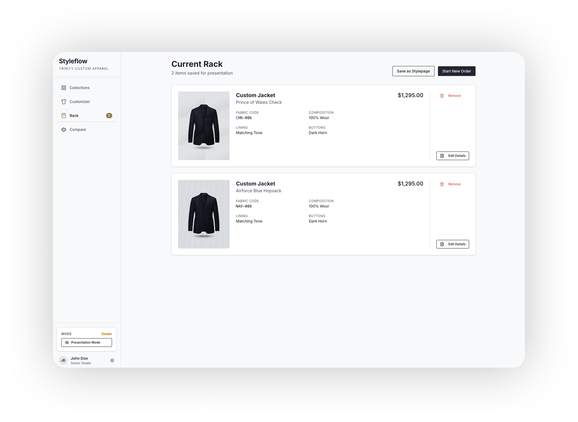
Browse mode — filter panel with collection grid. High-signal filters reduce the visible set before the dealer sees individual fabrics.
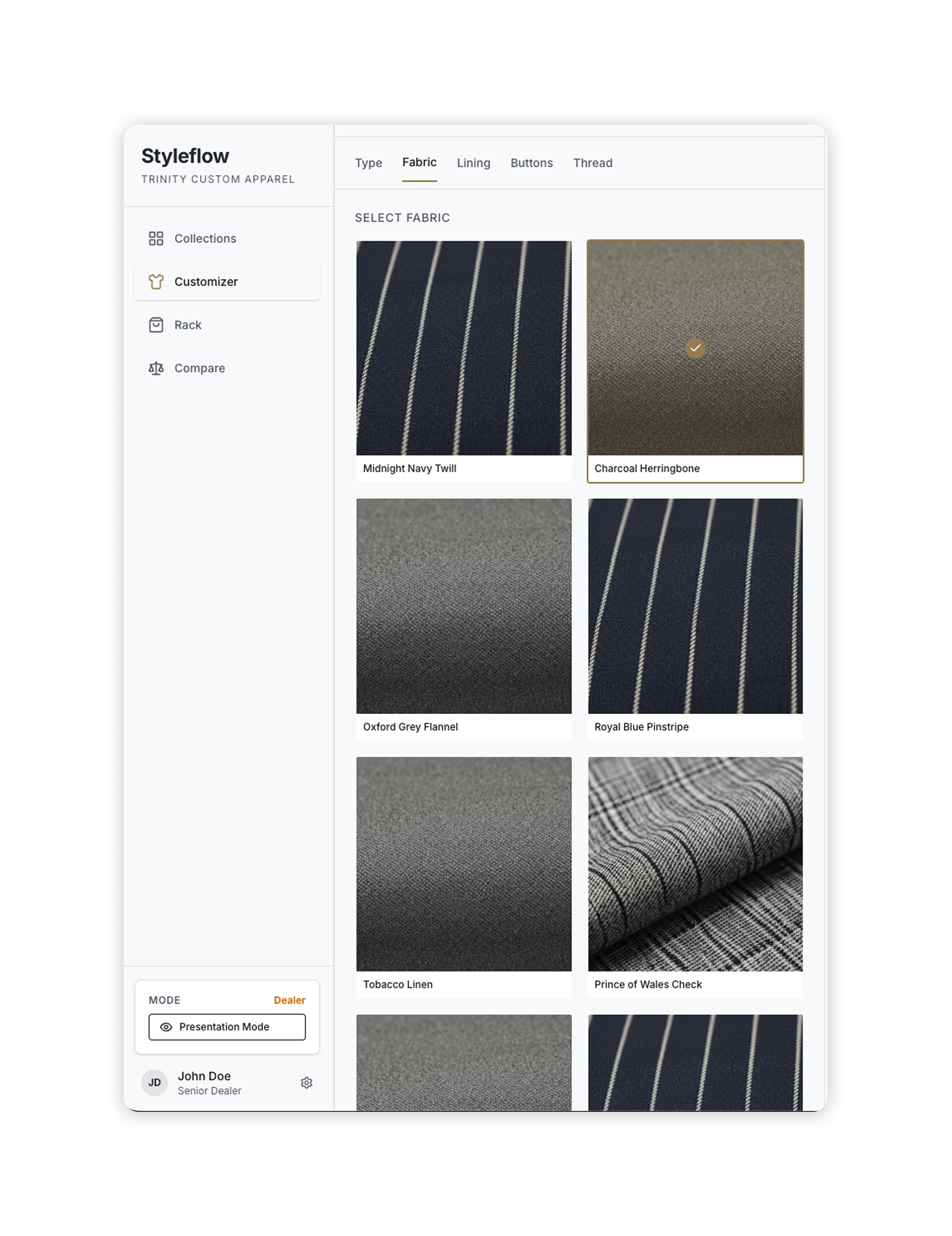
Visualize mode — Picario render left, trim selection right. The preview updates immediately on every selection.
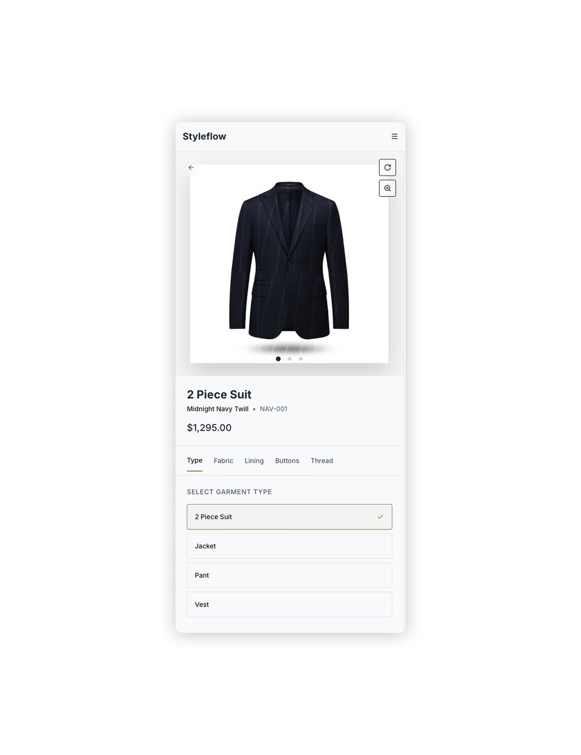
Responsive behavior — stacked column layout on mobile and tablet, side-by-side on laptop and up. The preview is always visible, just repositioned.
Engineering collaboration
I built every front-end component and owned the React implementation. The backend visualizer API — Picario rendering, base models, collections, fabric endpoints — already existed. My job was designing the interface's relationship with it.
Picario rendering
The rendered garment image is a URI that the backend constructs from selected IDs. The UI hits GET visualizer_fabrics/fabric with the full selection state and receives a rendered image URL. Loading states and fallback images are handled at the component level — the dealer always sees something, even during render.
Dynamic trim steps
The relevantMaterials array in the fabric response drives which trim components render. The component iterates the array, maps each trim type to its endpoint, and renders steps in API-defined order. Zero hardcoded step sequences.
Edit vs. create mode
A rackId URL parameter signals edit mode — existing selections are pre-loaded, the save action updates rather than creates. New and returning configurations share one component tree; mode is a URL concern, not a structural one.
React Router Outlet
The right configuration panel is a nested route Outlet. Each trim step lives at its own URL — browser back works, deep-linking into a specific step works, and the URL becomes an accurate representation of where in the configuration the dealer is.
The most important backend conversation was about the garmentTypeToQuickLookType mapping — which garment types have a QuickLook reference guide and which don't. That's a data question that had to be answered before the component could be built correctly, and it only surfaced because I read the API response rather than assuming the data I needed would be there.
Results
Visual confidence
Dealers see the exact garment before submitting — no more ordering by description
Faster
Fabric exploration and comparison across large catalogs — filters over search
↓ errors
Production handoff is structured data, not a description — fewer misinterpretations
"I can finally show customers exactly what they are ordering before we submit."
Sales team feedback, post-launch
Styleflow also became the foundation for Trinity Pocket — the Garment Configurator in the mobile app is a direct port of the same rack-based data model and Picario rendering pipeline. Building it well the first time meant the mobile version inherited the architecture rather than reinventing it.
Reflection
Reading the API before wireframing was the single most valuable thing I did on this project. The dynamic trim step logic — which turned out to be the most technically interesting part of the build — was only possible because I understood relevantMaterials before I drew a single screen.
Add saved looks and comparison mode. Dealers often want to show a client two or three fabric options side by side. Today, that means building multiple Racks and switching between them. A native comparison view — showing two Picario renders at once — would meaningfully change how Styleflow is used in a sales meeting.
Instrument analytics from day one. The styleflow_stats admin view exists but is lightweight. I don't know which garment types get configured most, where in the flow dealers abandon, or which fabrics get previewed but not ordered. That data should drive every future iteration.
Test with real dealers in a real sales context. The two-panel desktop layout works well in development. The real test is a dealer opening it on a laptop across a table from a client with uncertain wifi. The interaction model assumes a calm, unhurried environment that doesn't always exist in the field.
Key takeaways